Carousel with tab navigation functionality
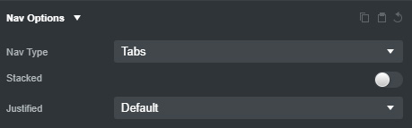
Tabs navigation
Drop a Nav component into your design
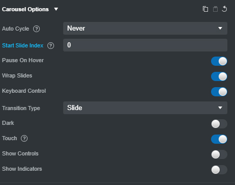
Carousel Options
Drop a Carousel component into your design and add this options
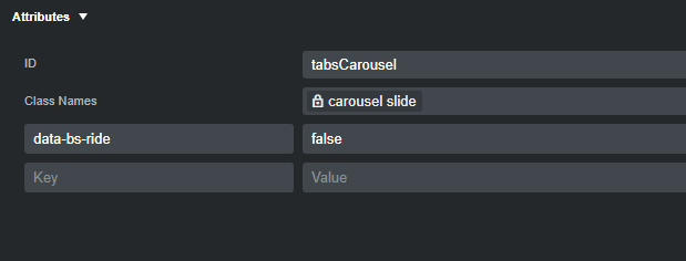
Carousel Attribute
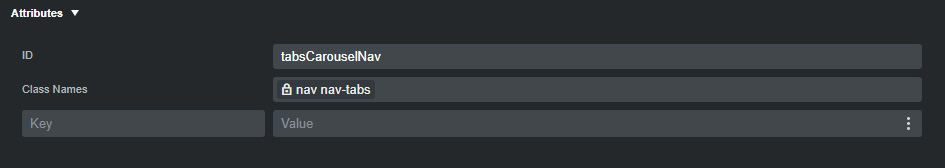
Add an Id=tabsCarousel to the carousel
Javascript
document.addEventListener(
  'DOMContentLoaded',
  () => {
    const tabsCarousel = document.querySelector('#tabsCarousel');
    const carousel = new bootstrap.Carousel(tabsCarousel);
    const carouselNavLinks = document.querySelectorAll('#tabsCarouselNav a');
    if (tabsCarousel && carouselNavLinks) {
      carouselNavLinks.forEach((link, index) => {
        link.addEventListener('click', (e) => {
          e.preventDefault();
          carousel.to(index);
          carouselNavLinks.forEach((link) => link.classList.remove('active'));
          e.target.classList.add('active');
        });
      });
      tabsCarousel.addEventListener('slide.bs.carousel', (e) => {
        carouselNavLinks.forEach((link) => link.classList.remove('active'));
        carouselNavLinks[`${e.to}`].classList.add('active');
      });
    }
  },
  false
);
This script sets up a carousel with tab navigation functionality. When a tab is clicked or when the carousel slides to a new item, it updates the active tab and applies the necessary visual changes to reflect the active state.